This is one of my main projects – a full UI design for an Inventory Management System. I designed it specially for factories or production units where tracking parts, orders, and supply chains gets really complex. My goal was to make the whole system super easy to use even for someone who’s not very tech-savvy.
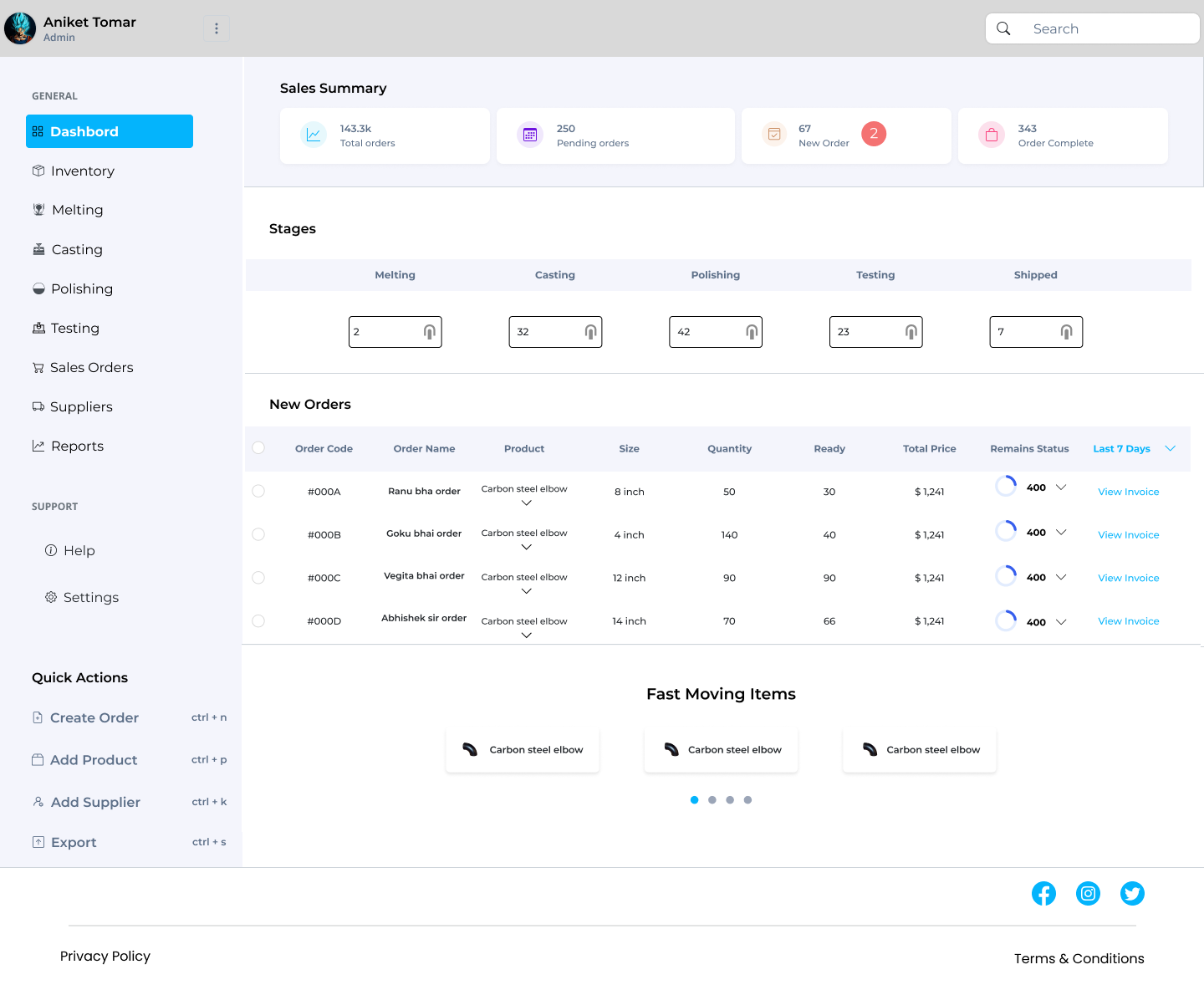
The dashboard is the heart of the system. It shows all the important stats upfront — total orders, pending orders, new entries, and completed orders. I added the stage-wise progress system (melting, casting, polishing, testing, etc.) so the user can track where each item is in the pipeline without checking each order one by one. It’s all right there, clearly separated.
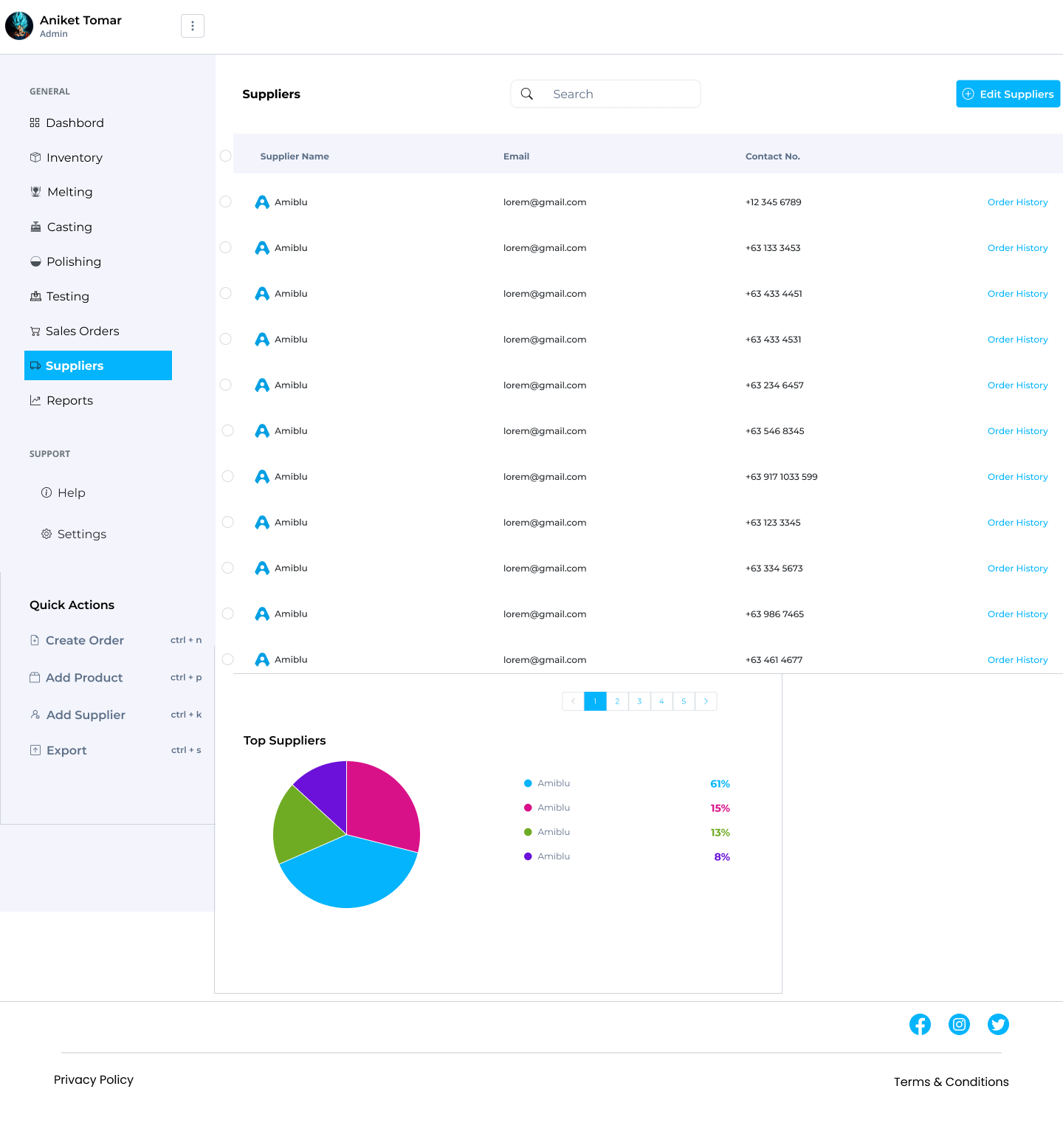
I kept the left sidebar fixed with clean navigation — because in tools like this, users want speed, not exploration. Every section (Inventory, Orders, Suppliers, Reports, etc.) is just one click away. I also added quick actions with keyboard shortcuts to help the admin team work faster.
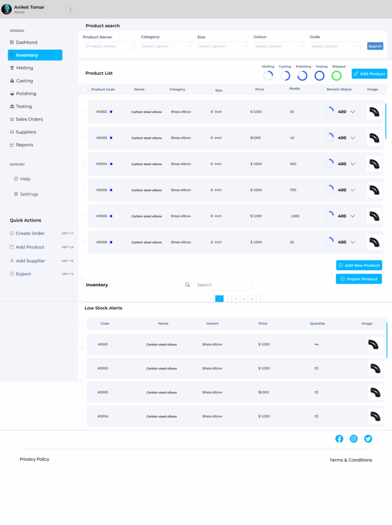
In the Inventory section, users can search or filter products by category, size, or code. It also has low stock alerts, so you don’t have to wait until items are totally out to reorder them. The status circles next to each product (showing process stages) make it easier to track movement in real time — so you always know what’s happening with which product.
One thing I really focused on was clarity and space. There’s a lot of data here, so I made sure the layout breathes well — using light colors, proper padding, and icons to break the heaviness. Even in the Testing or Supplier screens, tables don’t feel overwhelming. Each row is clean, scannable, and functional.
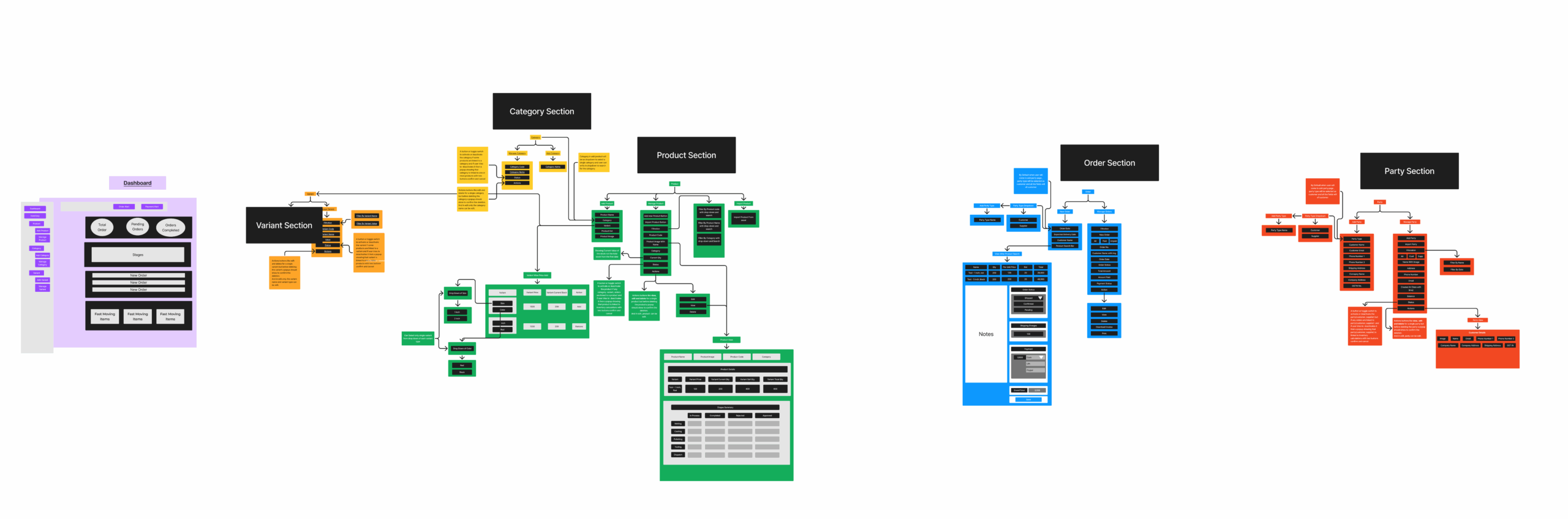
Also, I created a full workflow diagram (last image) before designing, to understand how every section connects — Product > Variant > Category > Order > Supplier, etc. It helped me figure out user paths and keep things logical and smooth.
Honestly, this project taught me a lot about designing for systems that run daily operations — where speed, accuracy, and simplicity matter more than fancy visuals. It’s not just about “looks good,” it’s about “works better.” I tried to make it feel easy, but strong.