This was my eCommerce UI project for a fashion-based platform called Shop.co — a clean, modern, and mobile-friendly shopping experience designed to help users find clothes that match their style quickly and comfortably.

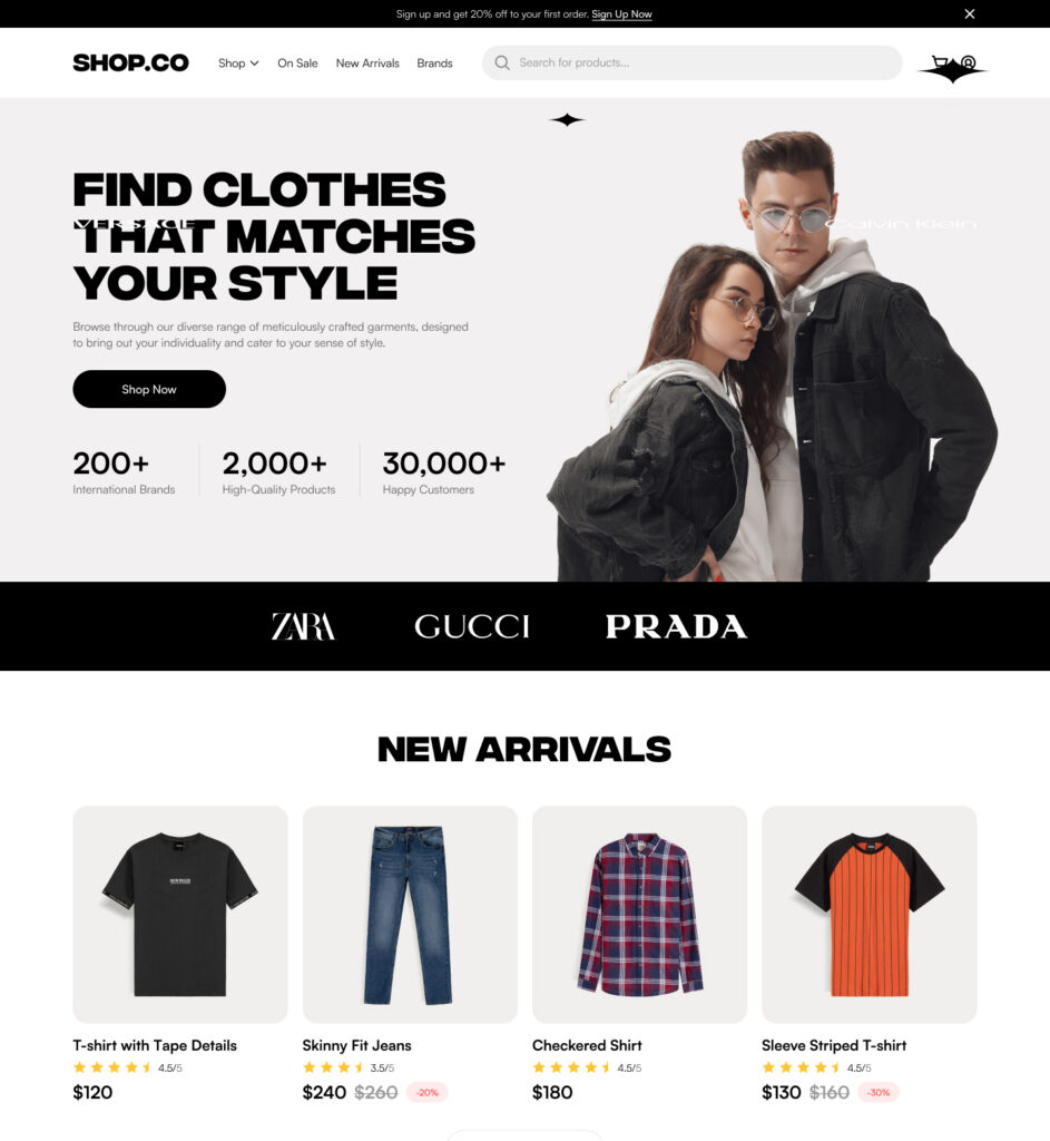
My goal here was to keep the interface minimal but stylish, giving users a premium feel without overwhelming them. I designed the homepage to highlight strong branding, with bold typography and a hero banner that communicates value clearly — like “200+ brands” and “30,000+ happy customers.” That section was meant to create instant trust.
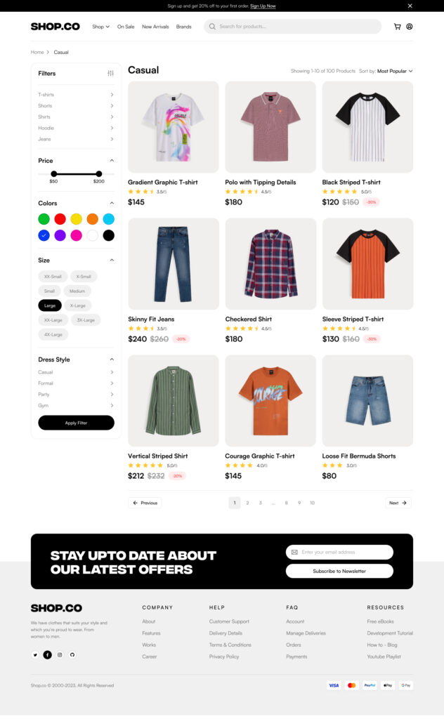
Below that, the New Arrivals section lets users jump right into products. Every product card shows price, rating, and discount (if available), using visual hierarchy to make it scannable at a glance. I also added support for sorting and filters like Color, Size, Price, and Dress Style so users can narrow down their choices in seconds — especially useful when you’re scrolling on mobile.
Speaking of which — yes, this UI is fully mobile responsive. I designed the layout to adapt naturally across devices. On smaller screens, filters collapse into a drawer-style menu, and product grids stack vertically to keep the experience seamless and clutter-free.
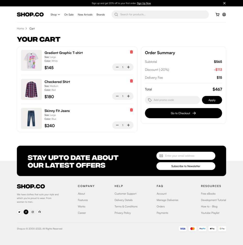
In terms of UX, I focused on speed and smoothness. Navigation is always clear with a top bar, sticky cart icon, and clear product filters on the side. The pagination at the bottom makes product browsing smoother — no infinite scroll mess here.
I also designed the footer to be functional yet elegant, including a newsletter signup, quick links, and brand info — all aligned neatly to give it a polished look.
This project was fun because it balanced aesthetic creativity with solid usability. It’s not just about making things look good — it’s about helping real people find, filter, and buy what they want without any confusion or friction. That’s what makes eCommerce work — and that’s what I tried to capture here.